Sandstone Waves by Stefaan Conrad

The first image collection trip of the school year is in the books!

A group of climbers and I took a speedy overnight out to a state park along the coast called Salt Point. The north end of the park features a prominent rock which is striped with climbing routes that start just above the waves of the Pacific.

It was an amazing experience being able to capture the power of the ocean against the stability of solid stone while having climbers delicately balanced between the two forces.

Projected for the next couple of weeks will be a series of photo trips to find some more beautiful locations where the talents of gifted athletes are honed by mother nature herself.

In the meantime, here is one shot from the weekend. I don’t plan to post all my content or my best content because I see some merit in reserving that for the final project. Thus, a side-shot for now.

045A7575.jpg

Thesis Development by Stefaan Conrad

Hi.

Hello.

I’m back…which is sad to say because I didn’t intend to be away from blogging in the first place. However, the past is behind and school has started, thus, now I must get myself in gear and pull together all the strings of my senior thesis.

As many of you know, I’m an athlete. Not because I love competition (I do), but because I love to push myself. However, running farther, biking faster, and pushing harder is only one part of what keeps me coming back to an active lifestyle. The other side of the coin is the where aspect of being active. I’m blessed to have an able body with which I can get out and be an athlete. I’m even more blessed to live in a county/region/state with so much beauty and so many stunning outdoor opportunities to experience. Thus, the question which I hope to tackle with my thesis:

How do I share what I feel it means to experience athleticism in nature with people who don’t have the same opportunities?

I want to approach this question by focusing (yay puns) my images on landscapes with an influence of athlete. I have experience shooting content focused on the athlete; close-ups, tight action shots, motion oriented, etc. I want to step back, think big, and make nature the hero — for without the incredible platform that Mother Nature provides, none of what we do would be possible (we meaning both athletes and photographers).

The previous paragraphs is a simple summary of the kind of content I plan to create. However, endgame goals are important to keep in mind while shooting. My dream is to design a print publication in a magazine style that will showcase not only a collection of landscapes, but a personal connection between each of the athletes pictured and the nature that they immerse themselves in. To do this I will create support content for the key landscape images as well as collect written stories and vignettes from the athletes themselves to add their personal perspective to their story.

How is this project going to push me as a photographer, designer, creator, and artist? This is what I’ve been mulling over quite a bit for the past weeks and months. In a way, I have at least a little bit of experience in every aspect of this project. However, I have never engaged in an endeavor which combines each of these bits of skill and experience.

I’ve made images as individual pieces. I’ve made small collections of images that go together and support each other. I will be challenged to maintain a cohesive look over the next months of shooting such that my images can be arranged in a successful way within a publication.

I’ve designed individual spreads. I’ve collaborated on book projects with a team. I will be stretched to apply my basic layout experience to engineer the best skeleton with which to showcase my images. Layout choices I make will undoubtedly set the tone for how viewers experience my photography.

I’ve tried my hand at type and vector design. I’ve designed a few stand alone graphic logos/icons. I will have to learn how to utilize type and vectors to work well within a layout as well as support the photography throughout the publication.

My work is cut out for me. I hope it will be enough of a project to amount to something worth calling my senior thesis. I hope I’ll put in the time necessary to make it what I dream it can be.

For those of you that made it this far, (mom, Aunt Carol, Mama Sue) thank you for reading! I appreciate the support and it really means a lot that there are people who read my posts.

Of course, I can’t end a blog post without something tasty to look at. Here are a few shots from my summer and the recent week of being back in NorCal.

Goat Rock by Stefaan Conrad

Finally, my project for this quarter, Goat Rock, is wrapped up and finished! I presented it to the class this week which marked the official end of the project. If you'd like to see the physical final piece, you'll have to come find me and take a peek. I made this short video to go along with my presentation so I thought I'd share it here as well. 

I aim to continue posting content here on a regular basis throughout the summer. I need to be shooting as much as possible and I have several goals relating to my senior thesis that I'll have to keep working towards. Stay tuned for my summer adventures!


Signatures by Stefaan Conrad

My Junior Studio project is due in a week. Thus, the final steps are in progress. I have all the spreads printed from the copy center and all that is left to do is to fold, assemble, staple, and trim each zine. I have prints enough for 10 copies which leaves me with 60 pages to fold one by one! Here are a few process shots just to set the scene. Little video coming next week! 

Yosemite by Stefaan Conrad

Two weekends ago I spent Mother's Day with family in Sunriver, one of my favorite places on earth with which I'm very familiar with. It was great to be in a place that I feel at home in and yet be far away from the school life. 

This past weekend I experienced a great contrast from that; I went camping in the Sierras and got to experience Yosemite Valley for the first time! We planned for thunderstorms and rain but we were blessed with gorgeous weather and incredible views. It's a little late to be just getting on the Yosemite train but I'm glad I was able to finally visit. Here a few pictures from the weekend. Enjoy!

Publication Layout by Stefaan Conrad

Week 7 of the quarter is about the time which I need to start the final stages of my project. Thus, layout and printing have been in the works over the past couple of days. I spend the weekend playing with different layout approaches and organizing my pages. The start of this week has had me placing my images and communicating with the print shop about paper finish, weight, and size. I've gotten the first proof made up but there is still plenty to do before it starts coming together the way I'd it to. 

As layout and printing lack images being made, here are some of the shots that are going into the 'zine. A little sneak peak, if you will. Enjoy!

Napa Valley Gnarnians by Stefaan Conrad

Warning: Fun Side Project Ahead!

(Studio project update slotted for next week, fear not!)

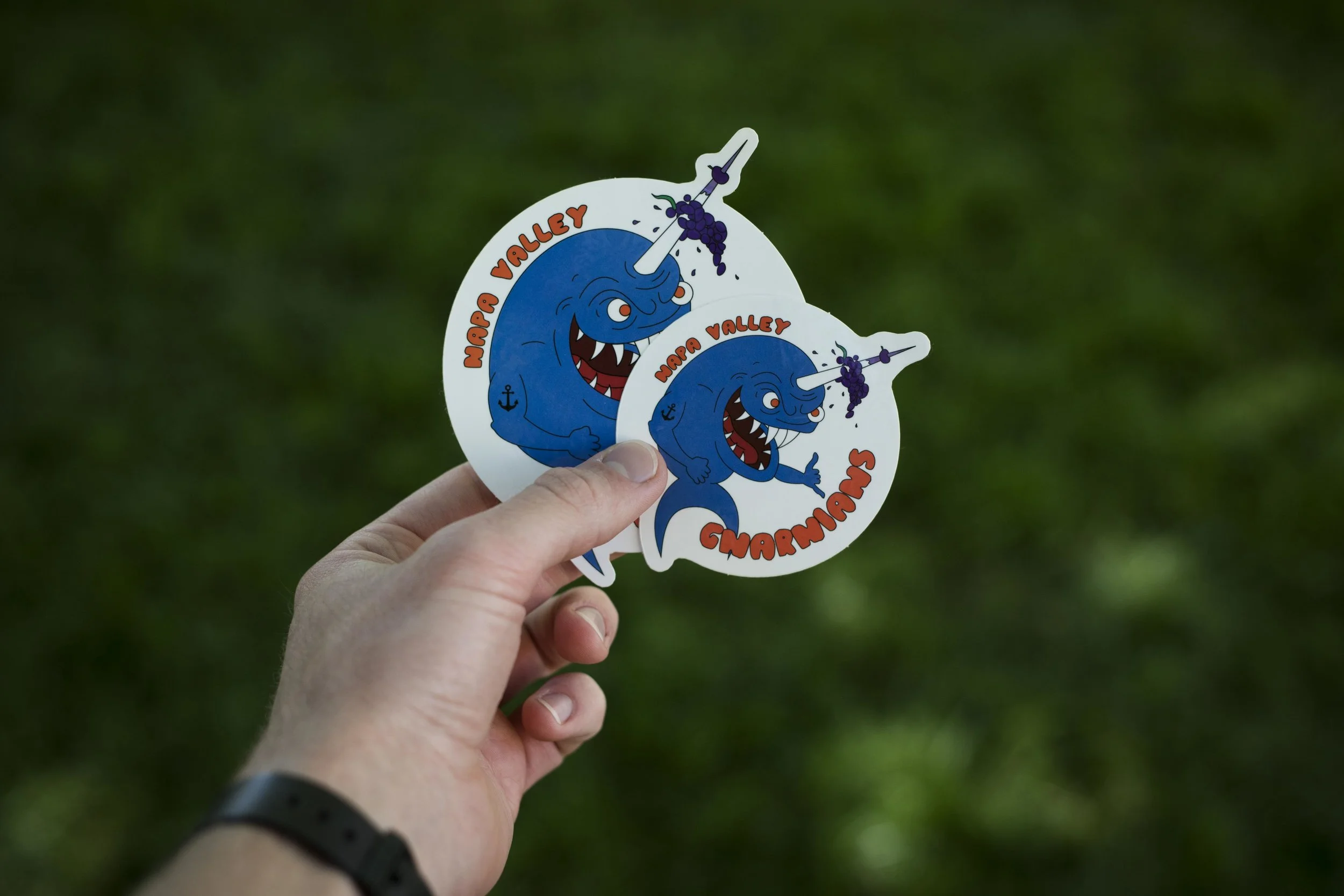
A few weeks ago, my Fisher Hall desk neighbor, Drew, came to me with a fantastic proposition; design a logo for his group of running buddies who call themselves The Napa Valley Gnarnians. Drew and his pals are quite incredible at what they do. He's won 100 mile races, competed with professionally sponsored athletes in 50 mile races, and climbs some of the sendiest routes in the area. Those races, I should mention, are running races...with his feet. There's been times where he's crushed out a marathon distance as training and still made it to church on time. Needless to say, I think some of these superhuman feats allow for the term Gnarnians (derived from gnarly) to be used for these guys. 

He gave me some sketches of what he had in mind and I rendered it and worked the text in. Yes, it's somewhere between elementary and grotesque but we thought it fit the vibe pretty well. Anyway, we ordered stickers and had the logo printed on a few pair of running shorts for the boys. We passed out the 250 stickers (yes, some ended up in the Atlas up at Walla Walla University) and started seeing it pop up on random water bottles, cars, and laptops.

Many have been stoked to have a free sticker but they ask, 'what's a Gnarnian?' I'll answer that question by quoting Drew; "Anyone can be a Gnarnian!" There's no requirements. You don't even have to live in the Napa Valley. It's a vibe. It's an attitude. It's the passion for going out, doing something new, and pushing farther than before. 

Rob Andrew, another Gnarnian, summed it up with a pre-run statement the other week, "I just wanna go far and suffer a little!"

Who knows...maybe we'll make shirts if enough people want them. 

ND Experiments by Stefaan Conrad

Last weekend I went back out to the coast...all by myself. Several people asked me if that was boring and lonely but, honestly, I had a blast! I listened to an audio book and took my time making pictures. I wanted to have no pressure from anyone else so I didn't bring anyone. 

I spent the hours with my camera on a tripod taking long exposures. Yes, long exposures during day time...made possible by accessories called neutral density filters. Basically, these are like sun glasses for your camera. On my trip, I layered up three pieces of darkened glass in front of my lens to drastically cut down on the amount of light allowed into my camera. By so restricting the available light, I compensated by leaving my shutter open for times upwards of four and a half minutes. I have yet to develop many of the shots I took but here's a couple that I've done a few minutes of corrections on. Enjoy!

Branding by Stefaan Conrad

Little side projects give me a tiny break from the rest of what school brings. Finding ways to release my creative energy in a direction that I find joy and for a project that is purely for me is great fun. Last week I was turned on to the idea of creating a watermark that I could slap onto my images with ease. I spent 15 minutes experimenting and I'm pretty stoked with what I came up with in such a short time. Here are a few sample images with the file plugged into my Lightroom export menu (so it does everything automatically for me). 

Silverado Mine by Stefaan Conrad

Partially due to feedback from my peers and friends and partially due to my subconscious  curiosities, I decided to pursue the idea of creating a small magazine documenting the bouldering lifestyle as seen along the Northern California Coast. This past weekend I went up to Mt St Helena to do some climbing. The site we visited is called Silverado mine and is the remnants of what used to be a gold and silver ore mine in the mid- to late-1800's. The network of tunnels below the surface has been closed for over half a century but at the surface remains a jutting rock face that has a deep gouge through the middle, creating a sort of rock hallway on the mountain side. Although bouldering and climbing have a very different visual aesthetic, I brought my camera to practice capturing the lifestyle aspect. Here are a few of the ones I liked from the afternoon. 

Santa Cruz by Stefaan Conrad

Here are some shots from my weekend trip to Santa Cruz. I put my camera in monochrome mode just to push myself to think differently. Had a blast using some different light tricks.

Note: Although the camera records a black and white image while in monochrome mode, it still writes a file with the color information in the scene, hence, the color in the eyes in the first image.

Norway by Stefaan Conrad

As a new quarter starts, so does a new photography project. I have several ideas, none of them I feel particularly drawn to over the others. Here are the short and sweet versions of each and, hopefully, all of you that read this will leave a comment about what you want to see here on my blog. 

  1. Lifestyle mini-magazine about bouldering along the NorCal coast. (Tentative name: Boulder Coast) This is also a possible senior thesis idea but expanded to a full magazine of course.
  2. Exploration of color and emotional expression through choice in clothing and colored smoke bombs. Key ingredient here; smoke bombs. (No idea on final presentation here)
  3. Portraits of the people that work and shop at Angwin Dorcas, the local consignment shop. This would piggy-back on another class project relating to volunteer hours.

Comment a 1, 2, or 3 if you'd like to see me take on one of these three concepts. If you have a particularly saucy idea that I have neglected to ponder then share that with me, I'd love the suggestions for future projects.

That's all for school things until next week when I have a project update.

Following is a brief note on my spring break experience.

I was fortunate enough to be able to spend the week with my girlfriend in Norway. She's pretty cool. She's also Norwegian, hence the destination. We saw a new city, tried a mancake, climbed frozen mountains, took a 7 hour train ride, explored Oslo, hung out with family, went cross country skiing, and ate more waffles than I've had in my life. (Okay not that many waffles...but there were a lot of waffles) Here are just a few snaps from the trip. Enjoy! 

Printing by Stefaan Conrad

The time of the quarter has come where dead week is upon me. Usually this doesn't mean much of a change for an art student. We go from working on projects to working on finishing projects. Of course, that means I'm in the closing stages of this project. YAY! I've started running some test prints to see if the lighting and color comes out on paper like it does on screen and that process is hard to show here on the blog. My file is too large to upload the composite print so I've photographed it in our viewing box.

My advisor recommended that to integrate the two locations even more I could rearrange the 6 small frames on the bottom to create some crossover and I really like what that did to the overall composition. A few touchups here and there and I should be well on my way to having this set wrapped up and done for!

*Excuse the tape and the glare, this is just a quick shot to give you an idea of what the final (larger) print will be like.

*Excuse the tape and the glare, this is just a quick shot to give you an idea of what the final (larger) print will be like.

Gap Work by Stefaan Conrad

I have some pretty talented friends. One of which has already been represented on my blog a few weeks ago; Alex. This week he was stoked to get out and ride for me yet again. We went to place in the forest which I personally call the Jump Graveyard. I've coined it this because years and years ago, the underbrush was dug through and some rather impressive jumps were built which, to use a millennial term, are quite sendy. Alex, being pretty much a professional bike racer didn't hesitate to hit some of these gaps for me. As I was shooting him on one gap, he would finish the jump just to keep hitting bigger gaps each time we took another run, eventually stringing together 3 plus gaps each being 15-20 feet in clearance. Needless to say I was impressed! Here's a quick GoPro edit of one of the gaps we were working with.

Anyway, enough story telling. Here are some of the images I got from the shoot. 

I did settle on one image which I wanted to work on for my final project. You may not like the choices I made but my intention behind adjusting the image as such his to create a final presentation that is as cohesive as possible. This means that my images from this shoot need to match as closely the lighting, color, and emphasis as the image from last weeks post. Here is what I've worked on thus far. 

Bike trails 3.jpg

I'm still in the process of color correcting the tighter shots to make sure that those fit in as cohesively as possible with the final presentation. Stay tuned next week to see how the presentation comes along this week. 

Thanks for reading! I appreciate you all. 

Post Process by Stefaan Conrad

This week I didn't get a chance to go out and shoot...yet. However, I did spend a little time looking at some of the suggestions I got on this image from two weeks ago. Several responses lead me to look into removing even more details from the asphalt and . After working smoothing things out I really like the changes.

Here I have an interesting view of my photoshop file. I have several screenshots cycling through showing you what the layers look like built from the ground up; starting with the base image out-of-camera, removing the stand, fixing blemishes and marks on the bike and asphalt, a small curves adjustment, and finally a dodge/burn layer to manually take control of the highlights and shadows. 

Suggestion: take a few seconds to watch this gallery cycle through several times, noting the layer additions and how it changes the image.


After the photoshop work I go back into Lightroom where I work on global adjustments. In the gallery below I have the image I shared two weeks ago juxtaposed with the most recent iteration after several rounds of photoshop. I've grown to like this one more and more as I tweak and adjust it. Hope you enjoy seeing some of the process that goes into producing an image of this sort. 

Enjoy!

Environmental by Stefaan Conrad

This week was almost too busy to get out and shoot but early this morning I remedied that with a quick trial run with Alex on some trails behind the dorms. I wanted to see what it was like taking a few shots with my own strobes versus using natural sunlight while out on the trails. It was freezing cold and my fingers wouldn't function but I'm happy with how this first shoot went. 

EF0C0078-Edit-Edit.jpg

Here is the shot I worked up using a little bit of strobe power. There is a flash in the bushes on rider left with a small umbrella to soften the light and give it a little more natural feel. The sky in the background was blown out so I put in a hint of a sunrise which I haven't decided wether or not I like. We'll see how far I take this one.  

EF0C0146-Edit.jpg

This one is using just the early morning sunlight to bring Alex out of the background. I had him pull up off the ground just as he rode out of the shade. Having him in the air gives it a more dynamic and active feel. 

I hope to get out and shoot again this week and, of course, I'll put up what I create here next week. Enjoy! 

A Little Bit Rugged by Stefaan Conrad

Last week I had a chance to squeeze in a shoot that I think worked out to be far more successful than the week before. The location of this shoot was no more that 20 feet away from the first shoot yet the look is quite a bit more fitting, in my mind.

I utilized the giant double doors we have in the studio and set my camera up just inside the doors with a 90mm tilt-shift lens aiming out the doors. The tilt-shift lets me put my camera almost on the floor and, while keeping it horizontal, capture the whole bike in the frame. Outside in the parking lot I set up one strobe with a 6 foot umbrella soft box on a boom pole. Umbrellas have the ability to create a zone of light that softly fades out farther from the center of the light direction. I like this effect because this way I can keep the subject nicely lit but the light will softly dip out away from the subject. The boom pole allows for the light source to have a great range of location and direction. This meant I could position the giant umbrella above the bike, behind it, or next to it with ease. With this technique I made several frames with the light coming from different directions, highlighting different parts of the bike in every shot. 

Having several different frames all with distinct highlights lets me pick and choose what I like from each image in post-processing. After several hours in Photoshop and Lightroom retouching, blending, removing stands, and color toning here is the final image from this shoot. 

EF0C0174.2-3.jpg

Any critique from whomever makes it this far would be greatly appreciated! You can comment here on the post what you like or what you don't like. 

Thanks for reading!

First Shoot by Stefaan Conrad

After prepping for my first shoot last week I was able to get into the studio and make some images. It was a good practice session. I say practice because after looking at my frames in Lightroom I realized that what I'd come up with isn't what I'm looking for. 

Let me explain...using some imagery. 

Here is a raw, unedited shot from the studio session. 

2018-01-25-17.09.04 ZS PMax.jpg

On a small screen or at a glance this looks like a decent place to start but when I looked closer and sized up the retouching nightmare this would be I realized I'd be better off starting with a new shoot. Here's what I mean.

2018-01-25-17.09.04 ZS PMax-2.jpg

Now it's pretty easy to see the amount of clean up this would need to have a 'studio style' effect. The hours I'd spend cleaning up this image would land me with a bike on clean white-to-grey. I thought about this look and decided that's not what I want for this image. 

My new thought is that for my studio bike image, I'll still use studio lighting but in a non-studio location. This allows more room for a 'dirty' or 'grungy' scene (mountain bikes are made for the dirt...rather fitting in my mind) and definitely might lead to a more interesting image by having something for the ground and the background rather than pure white/grey.

To end this post on a more positive note, here is one of the tight angle shots that I do rather fancy (pinky fingers up). The shape of the handle bars becomes organic up close which is conflicting seeing as an aluminum bar has very few innate organic qualities. Enjoy. 

Till next week

EF0C0037.jpg

10,000 Hours by Stefaan Conrad

They say it takes 10,000 hours to master something...I'm nowhere near that in anything I like to do but maybe someday I'll have spent a large number of hours behind my craft. This is another project that'll get me closer.

I've decided on a printed image presentation. I want to pursue a product photography angle on a mountain bike in two different environments. My concept goes as follows: two large prints (one each from studio and environmental scene outdoors) and with each large print, three small accent prints showing tight angle shots relating to each environment shown in the large print. Of course this is subject to change at any time but that is my current direction.

I made a few frames to document the progress of my project board so I could share on my blog what my workspace looks like. Here it is...my desk...aka my new living space. 

EF0C0148.jpg

Along with collecting some inspiration on my board I've started to prep for my first studio shoot. I plan to use my own bike for this shoot just to familiarize myself with the way light plays on the geometry and assembly of a bike. I spent a chunk of time cleaning my bike, as it was literally caked with mud from my ride last week, and I documented the process so I'll have a record of the steps but also to share some visual activity here on my blog. 

PRESENTATION!!! by Stefaan Conrad

Greetings again, blog-sphere! Or blog-iverse? Maybe blog-world works better. 

Progress update on my Junior Thesis is as follows: NONE!

That's not completely fair, though. I have spent many a moment deep in thought pondering the direction of my creative efforts this quarter. However, if all I do is think, then I won't really have much to show for myself. I haven't started sketching, mood boarding, scrap collecting, or shoot planning but that will surely happen...soon...ish. 

I guess the best way to show what progress I've made in my pensive moments is to share what I am hung up on: presentation. I know presentation is typically THE LAST thing you focus on in a creative project but I've reached a state of limbo in which I don't know how I want to present so I don't know how to shoot. In my mind, the strongest project is going to be created from the ground up with the presentation as the focus. Sure, I can shoot a series and then worry about that later but the cohesive value and overall impact will feel so much stronger if presentation is the emphasis. 

Currently some presentation ideas I've been mulling about are as follows: a 'zine (baby magazine, smaller than a typical mag with fewer pages), a printed series (potentially two large images with several tight angle shots complementing each large print), or maybe an online gallery here on my portfolio. Honestly I'm very open to any ideas...as I'm clearly a little stuck. That being said...

Please feel free to suggest anything you like!*

*No need to know content to suggest, whatever you imagine could be helpful to me.

Now, if you've made it this far through my post, I'll share what I did work on this week. I am working on some product work for a friend. This project is still in progress so I'll share some more as it comes to fruition shortly but here is a wee teaser of what I spent several days on this week. Enjoy!

EF0C0782.jpg